Living Colours: The Psychology of Colour Inside your Home
The world is standing still, but inside our homes, it’s getting colourful.
~

We’re stuck inside and all of a sudden we’re noticing chipped floors, dusty baseboards and our total lack of every piece of designer furniture we’ve ever dreamed of. Well, lockdown might not be the time to go and purchase an Eames chair, but how about giving your rooms some new life?
Painting a room, a wall, or even just a piece of furniture can transform an entire space. However, before you head to Farrow & Ball or Amazon, let’s look at how colour affects our mood and which shade, hue, and tint is the right one for you.
Pro tip: in these confining times, we would recommend checking with your significant other before taking on a project of this scale. They may know nothing about interiors, but they’ll definitely have an opinion.
Let’s take a look at how The Plum Guide’s collection plays with colour.
PAINT THE TOWN RED
Ah… the colour of love. It’s said that red can increase the human heart rate and make us feel more energised. Red can instantly add a romantic and passionate note to your home. Use it generously to create a sense of drama, while just a splash of it can warm up a space and create a focal point. Of course, there is a great variety of shades available and each one can evoke a different feeling, especially depending on its context and surroundings – paint a whole room red and it will make it feel more intimate, or choose a feature wall to change the perceived proportions of a room. The options are endless, so here are some wonderful examples.
AT FIRST BLUSH
Pink is a wonderful and more delicate part of the red family, and of course, all the rage because it’s such a versatile shade that matches with just about every other tone. It’s the sibling of the family that can do no wrong and is annoyingly easy to get along with, never picking fights and always having something nice to say. There’s a femininity and subtlety to pink because it evokes a similar feeling to red, of excitement and passion, but a muted shade adds a touch of innocence. Paired with dark woods, however, it’s easy to create a balance of calmness and maturity.
AS KEEN AS MUSTARD
You know it, we know it, the whole world knows it – Mustard is where it’s at. But that’s not the only shade of yellow that we can get behind. Yellow is known to activate memories, as well as promoting creativity. Of course, flowers such as daffodils and daisies (really, the friendliest of flowers) add to this feeling. It’s, therefore, a wonderful touch in any room that feels a little bit sad or overlooked. A toned-down version of yellow can make a room feel larger, or you can add a bold, sunflower yellow for a contemporary and sophisticated look.
ORANGE YOU GLAD?
Known to promote health while giving off a youthful and uplifting spirit, it’s understandable if you’re a little reluctant to give your home a stroke of orange. Don’t be, this wonderfully versatile colour is energising by day and cosy at night. Plus, you can always opt for a muted shade, such as apricot – these softened tones are known for their calming effect.
GIVE IT THE GREEN LIGHT
Who doesn’t love the relaxing energy of green? Its calming effects are grounded in its association with nature. As with the others, there are tonnes of palettes to choose from. A dark shade can be dramatic yet cosy, while the lighter tones create a sense of harmony and new beginnings. Try an olive green for soothing bedroom walls, or sage if you’re in the market for a fabulously sophisticated shade whose grey undertones make it easy to balance with natural wood.
PURPLE REIGN
Queens better listen up. Purple is the colour of royalty, luxury and power. It also stimulates the imagination – though surely those two can’t be related? Try lilac if you’re in the mood for a serene look with a touch of magical mystery, or go for a bold and regal purple if you’re trying to create vibrancy in a room. Just remember that you don’t need to go overboard with this colour. Just a touch of it here and there is enough to create a whole new vibe for your environment.
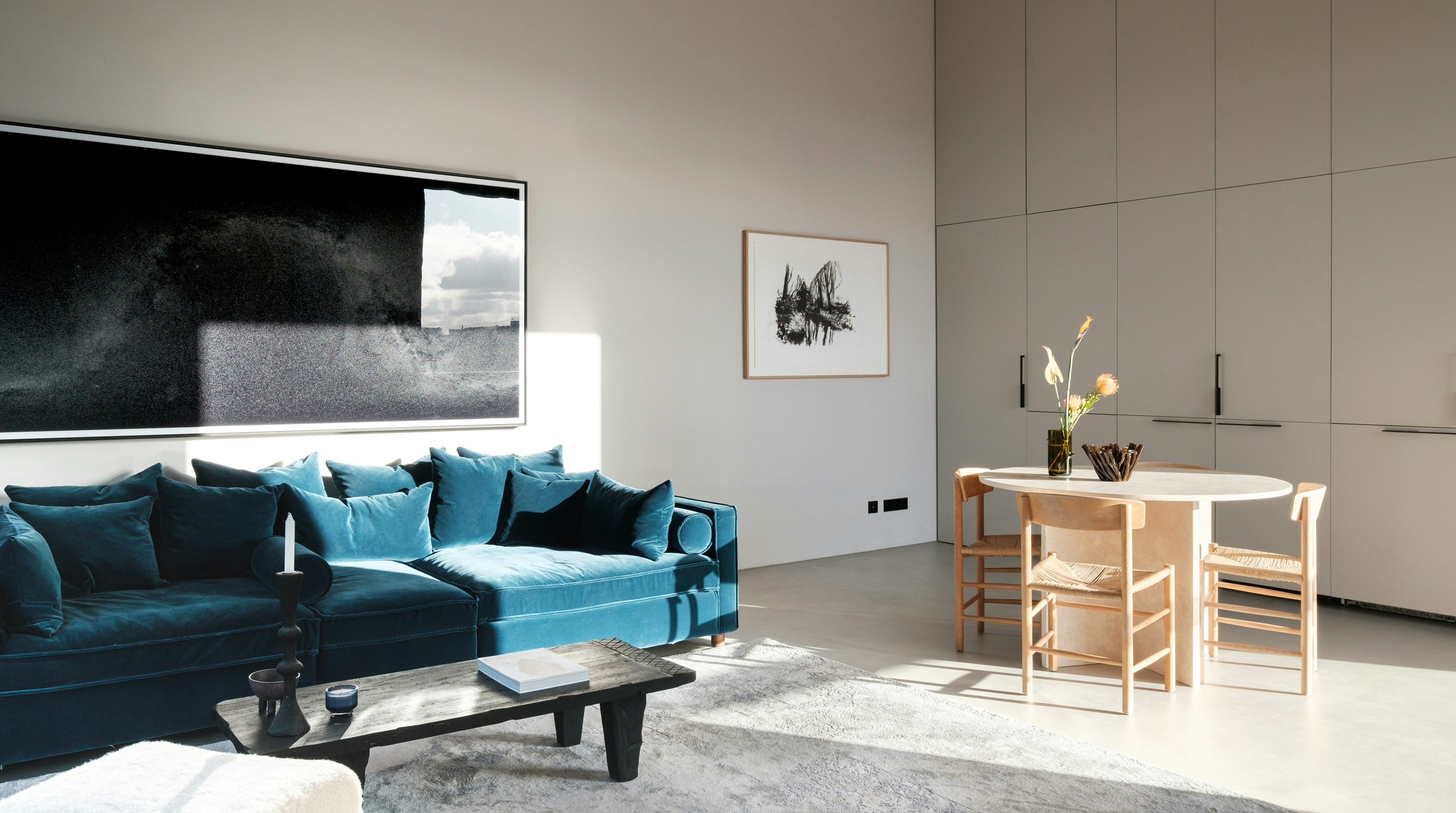
ONCE IN A BLUE MOON
This classically cool colour is almost always a good idea. In its association with the sky, blue is naturally a shade that gives a feeling of openness and sincerity. It is, therefore, an excellent choice if you want a room to be an oasis of peacefulness. Its naturally calming elements also help us concentrate, making it a beautiful choice for an office. Did you know? If blue is your favourite colour, it is said that you are trustworthy, strong and loyal.
AFTER DARK
It might not be the first colour palette to jump to mind if you’re thinking about giving your home a new look, but let us tell you exactly why you need it. This is the most elegant shade of them all – its mystery and power encourages reflection and also means you can create a sleek look without much effort. Of course, too much of these dark tones and it can feel depressing, so instead opt for a single wall or bold accents to add drama to your home. Here’s some inspiration.
That’s it from us. Take care of yourself and take this golden opportunity to spruce up your place.
Yours truly,
The Plum Guide Team